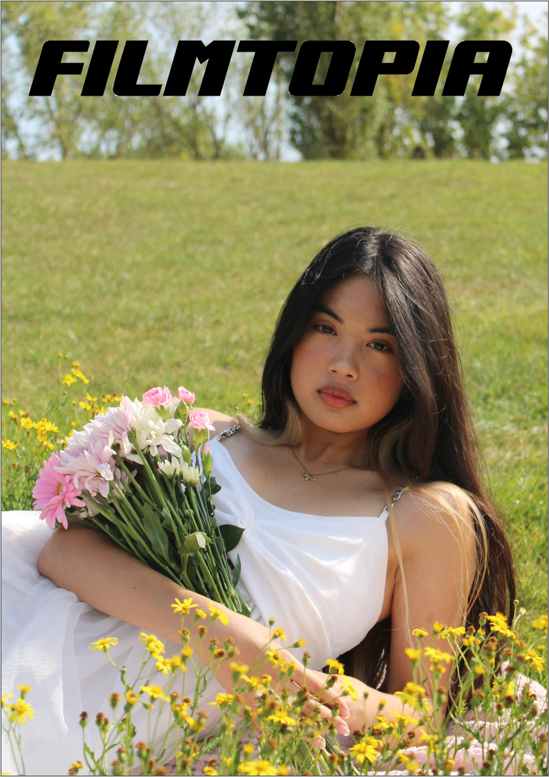
To find the best picture for my film magazine front cover, I chose my three favourites and compared them side by side.
After choosing my favourite, I cropped and straightened the image.
This lesson, I cropped the image even more to eliminate the trees in the background. I also made a cut-out of Alizah and used the erase tool to remove flyaway hairs and then pasted the subject over the front cover, so that her head covers part of the masthead.
I then used generative fill on Photoshop to increase the amount of grass above the model so that the masthead had a nice plain background to go on top of.
To make my designing process more efficient, I worked solely on the first magazine to establish the Filmtopia design layout so that I could then use the same design and make minor edits to fit the second film, saving time compared to working on both editions simultaneously.
I wanted to recreate the same seamless effect I made using the extended bed across the two contents pages and came up with the idea of achieving this using a picture of purple flowers that I took at the photoshoot location of this model's photoshoot. I used the eraser in Photoshop to remove the background of the flowers to create a transparent png of each, which I then duplicated to create a row of flowers across the two pages.
I then took the layout of the completed contents pages of the first magazine and wrote in the copy for the second magazine. Writing in the copy after the layout and design was finalised saved a lot of time compared to working on both magazines simultaneously.


No comments:
Post a Comment