Front Cover:
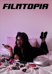
To find the best picture for my film magazine front cover, I chose my three favourites and compared them side by side.
I then cropped the image I liked best.
I then changed my mind and decided I liked this picture more for the face pose, but then I thought the hand looked a bit awkward and the bed was a bit cluttered. I also chose a new typeface for my logo as the first one looked more like a sports magazine logo, and this one looks more similar to Empire Magazine's font, making it more in line with film magazine conventions. I also added the sparkle motif myself because I liked the look of it and I planned to use it to create a stronger sense of branding throughout my work.
So I used Photoshop to cut out the hand and body area from the first picture I chose and combined it with this one to make a front cover with the best hand and face pose. I also edited the bed to remove the 3DS case because it looked a bit cluttered. It took a while but it was worth it.
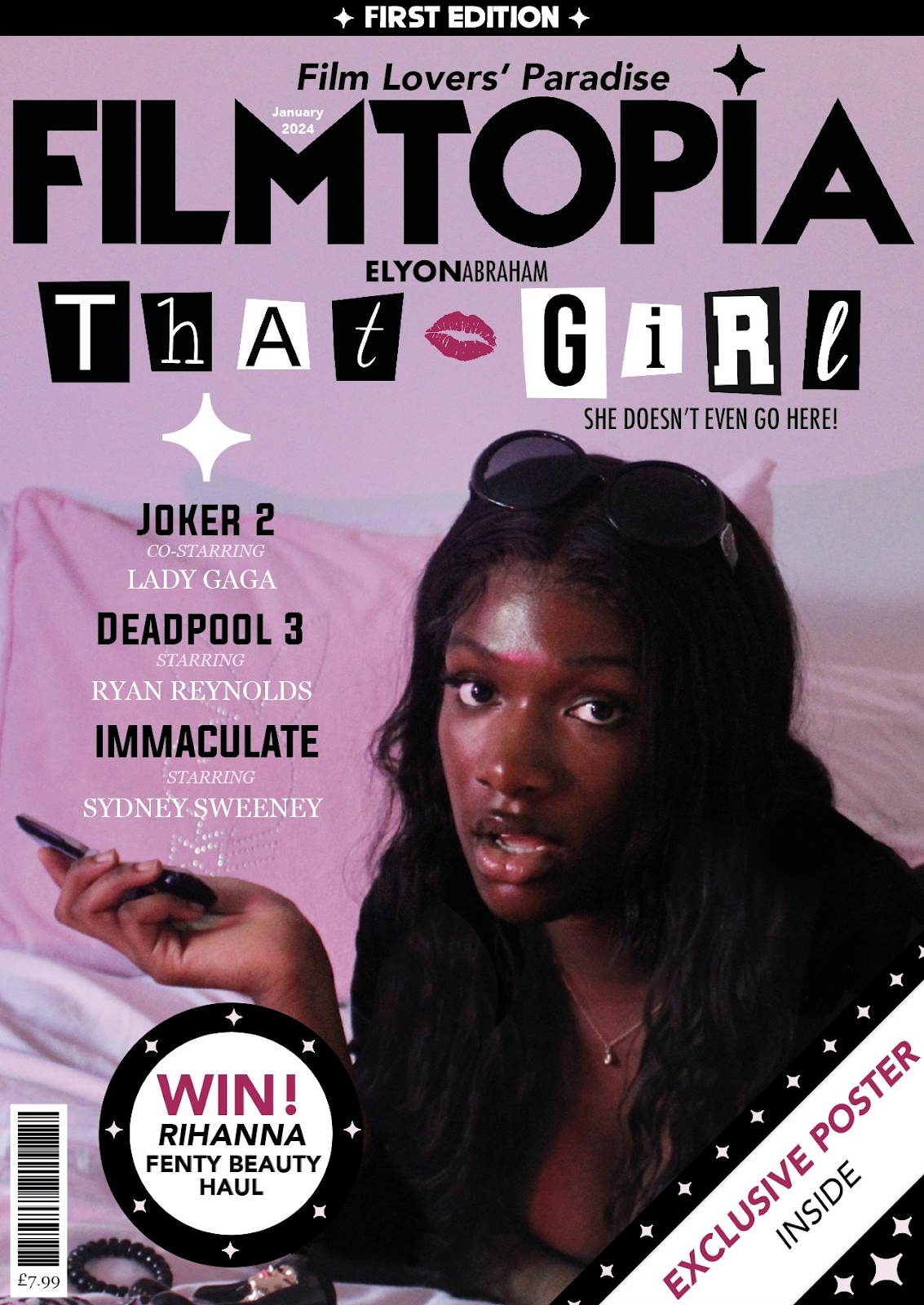
Here I started adding some more graphology features. I thought the top of the cover looked a bit unbalanced compared to the bottom that had the 'exclusive poster' banner so I added a banner at the top too to make the cover look more cohesive and complete. I also put 'first edition' in this banner as I thought it looked good. I added a plus symbol stylised as the sparkle motif to introduce the smaller cover lines. I also added a border around the barcode to add more realism and it looked nicer.
Here I added a puff to advertise my competition and I improved the cover lines by making them fit the colour scheme (black, baby pink and white). I also came up with the film name, That Girl and put the lipstick stamp motif in the centre and made the letter placement more uneven as it more closely resembled the layout of the original Burn Book typography which I was trying to reference.
I improved the design of the 'win' puff as the design before didn't match the look of the rest of the front cover. I made it match the 'exclusive poster' banner and include more sparkle motifs to further establish the Filmtopia branding. I removed the 'featuring' line as it wasn't conventional of other film magazines such as Empire Magazine, and it looked better without it. I also made the cover lines centre to make them look better.
I then changed the colour of the 'exclusive poster' text to match the 'win' text and lipstick stamp motif as it added a nice bold accent colour whilst also highlighting the most important parts of the magazine (competition, exclusive content and Mean Girls intertextuality). I made the puff bigger and the barcode smaller to make the size of the elements correspond better to their importance on the page. I also added some context about the film That Girl to make the genre and intertextual reference more obvious by using the line "she doesn't even go here!" (said by Damian in Mean Girls). This is direct intertextuality to Mean Girls and it also hints at the plot of the film (Alyssa moves to a new school). I also added the actor's name above the film name to replicate the style of original Mean Girls posters and used the typefaces to make this reference clearer.
I then decided against the text with the actor's name as I wanted the design to be more universal between both issues and the other issue didn't include this text. But I still used this design for the film poster.
To make my intertextual references to Mean Girls more obvious, I designed the That Girl logo to look as similar as possible to the Burn Book from the original 2004 Mean Girls film. I used the same font as this Mean Girls poster to introduce the actor's and character's names, using the same mix of bold and regular typefaces and placing them closely together.
Contents Page:
My first draft of my contents page has the Filmtopia logo, contents page title and other subheadings in Evogria and the three-column layout. I also chose to make the accents colour baby pink to match the bed sheets and compliment the main image.
I then decided to make the background black as it recreates the feel of a dimly lit cinema and also it highlights the baby pink dividers and sparkle motifs more and compliments the main image. I also added a banner to match the look of the front cover and added baby pink shadows to the 'contents' title.
I then added the 'first edition' text to match with the front cover and extended the banner across both pages. I added a framing design with lines and the sparkle motif.
I then got rid of the framing design because it reduced the space for copy and it clashed with the new design I made: the bed flowing across the double page spread. I chose this design because it looked unique and creative to me and it helped bring the two pages together as one cohesive contents page rather than two individual pages, which I liked. It also draws more attention to the image and brings it closer to the viewer, almost creating a 3D effect like you're in the room with her. I particularly wanted to draw more attention to the makeup on the bed as this links directly to the competition advertised on the front cover, website and contents page: the Fenty Beauty haul. The prize is £500 worth of makeup from a Fenty Beauty and That Girl collaboration (the makeup is featured in the film), so the focus on the makeup on the bed references how the makeup is used in the film and makes the competition seem more appealing as there's a visual representation of the prize, making readers more likely to enter, therefore increasing audience interaction.
I then removed the image of the That Girl film as it had the same mise-en-scène as both the front cover and main image on the contents page so I wanted to include something different. I added copy to include the details of the competition and added a review from Color of Change (an organisation whose mission is to achieve racial equality in many areas including media representations. Quotes from the 'culture change & media justice' section of their website: "ACHIEVING MEANINGFUL DIVERSITY AND INCLUSION BEHIND THE SCENES IN HOLLYWOOD" "ENSURING ACCURATE AND DIVERSE REPRESENTATIONS OF BLACK PEOPLE IN MEDIA")
I then added the rest of the subheadings and copy for my features as well as improving the design of the Color of Change review. I also included another rating from the BFI London Film festival. I also added more decorative sparkle motifs to add some extra design flair and fill up some empty space.
However, I realised that I didn't have enough images on my contents page, so I added a picture I took to advertise the filming locations tour of That Girl in London. I also added a picture of me, using the style that Empire Magazine does (a cut out with a line underneath) to make my work more in line with film magazine conventions..
I also realised that my call to action for the website wasn't as obvious as it could be (it was included in the copy under the giveaway subheading) so I added a working QR code linked to my website with a subheading to inform the reader of where the QR code leads to (and added some decorative sparkles). I also put some more sparkles around my picture because I thought it looked more creative and there was too much blank space. I also added my full name into the signature instead of the initial and surname as I thought it created a more friendly and approachable feel to encourage audience participation (the editor's letter on the website also reflects the friendly register). I also added a feature that provides more information about the That Girl film to help provide context to the "she doesn't even go here!" quote on the front cover.
I then added the sparkle motif section divider between the 'follow us' and 'editor's letter' subheadings to keep the design consistent with the rest of the contents page and the website. I also did some final proofreading to fix any mistakes.


No comments:
Post a Comment